Context
Overview
Glucofit was developed as part of a 13-week capstone project, aiming to simplify glucose monitoring for individuals with prediabetes and diabetes. Our goal was to create an engaging and user-friendly mobile app that automates glucose logging, provides personalized insights, and encourages healthy habits through interactive challenges.
Working with a team of four designers and four developers, we designed and developed an MVP with three key features. The project challenged us to balance feasibility and usabilty while ensuring the app met the needs of our target users.
My Role
As a Project Manager and UI/UX Designer, I played a dual role in overseeing the overall progress of the project while designing the key pages assigned to me. I maintained constant communication with our lead developer, Ishi Hisashi, and lead designer, Kat Nervez, to align design and development goals. This has helped our team to keep on track and ensure that our MVP was both functional and visually cohesive. As a UI/UX designer, I was responsible for designing key app features, including the automated glucose logging, personalized insights and history log pages. Additionally, I created the promotional materials such as one-pager and social media posts to showcase our app to the audience and enhance its visibility.
Timeline
Our team had 13-weeks to design and develop Glucofit. We used the agile workflow, working in sprints and conducting stand-up meetings to track progress, address challenges and ensure alignment between design and development. Designers had roughly 7 weeks to complete the design process, from research and wireframing to protyping and iteration, before handing it off to development.


The Problem
Managing blood sugar levels can be overwhelming for individuals with Type 2 diabetes and prediabetes, especially with traditional methods like manual glucose tracking. Many patients struggle due to a lack of personalized insights, motivation, and easy-to-use tracking solutions. Existing apps often fail to provide engaging features that encourage consistent health monitoring. As a result patients may find it challenging to adopt healthier habits, track their progress, and stay motivated on their journey to improve their overall health and reverse their condition.
Our Solution
Glucofit is designed to help individuals with prediabetes and diabetes monitor their blood sugar levels effortlessly through:
Automated Glucose Logging
Streamline the process of glucose logging and monitoring.
Personalized Insights
Educate users about diabetes management, food and lifestyle changes.
Gamification
Encourages consistency through weekly streaks and milestone badges.
Design Process
Research
Our research began by creating interview scripts and conducting user interview for prediabetic/diabetic patients as well as health practitioners. This allowed us to gain a deeper understanding of user pain points, identity and prioritize key features, and develop user personas to ensure our design aligned with user needs.
Research
User Interviews
We started off by interviewing two type-2 diabetic patients and one prediabetic patient. We asked them questions like...
- How do you currently monitor your blood sugar levels?
- Do you use any apps to share information with your doctor?
- When and how often do you check your blood sugar levels?
- How do you keep track of your medication or insulin doses?
We also conducted interviews with two health practitioners and asked them questions like...
- What are the most common issues patients face when it comes to monitoring their blood sugar?
- How frequently do patients monitor their blood sugar, and what patterns have you observed when it comes to their own monitoring?
- What kind of tools do your patients currently use to track their glucose/ blood sugar levels?
- What challenges do you face in helping patients stay consistent with their diabetes management?
We found that
Prediabetic and diabetic patients primarily rely on manual methods in tracking and monitoring their glucose levels without using an app. Consistency is one of the main issue as many patients tend to stop monitoring once their glucose levels stabilizes and only resuming when symptoms worsen. Healthcare providers also struggle with patient education, as many individuals lack a clear understanding of diabetes management leading to poor-self monitoring habits.
Research
User Personas


Research
Competitor Analysis
MySugr, OneTouch, and Glucose Buddy help users track diabetes-related metrics but fall short in providing in-depth insights or a holistic approach to better understand and manage their condition. While they simplify data logging, they often lack robust tools to connect habits, such as lifestyle, food, and medication, to outcomes or offer tailored educational support.
This leaves patients with limited guidance and a fragmented view of their health, making long-term diabetes management more challenging.

Userflow

Wireframes
Low-Fidelity Wireframes
Screens
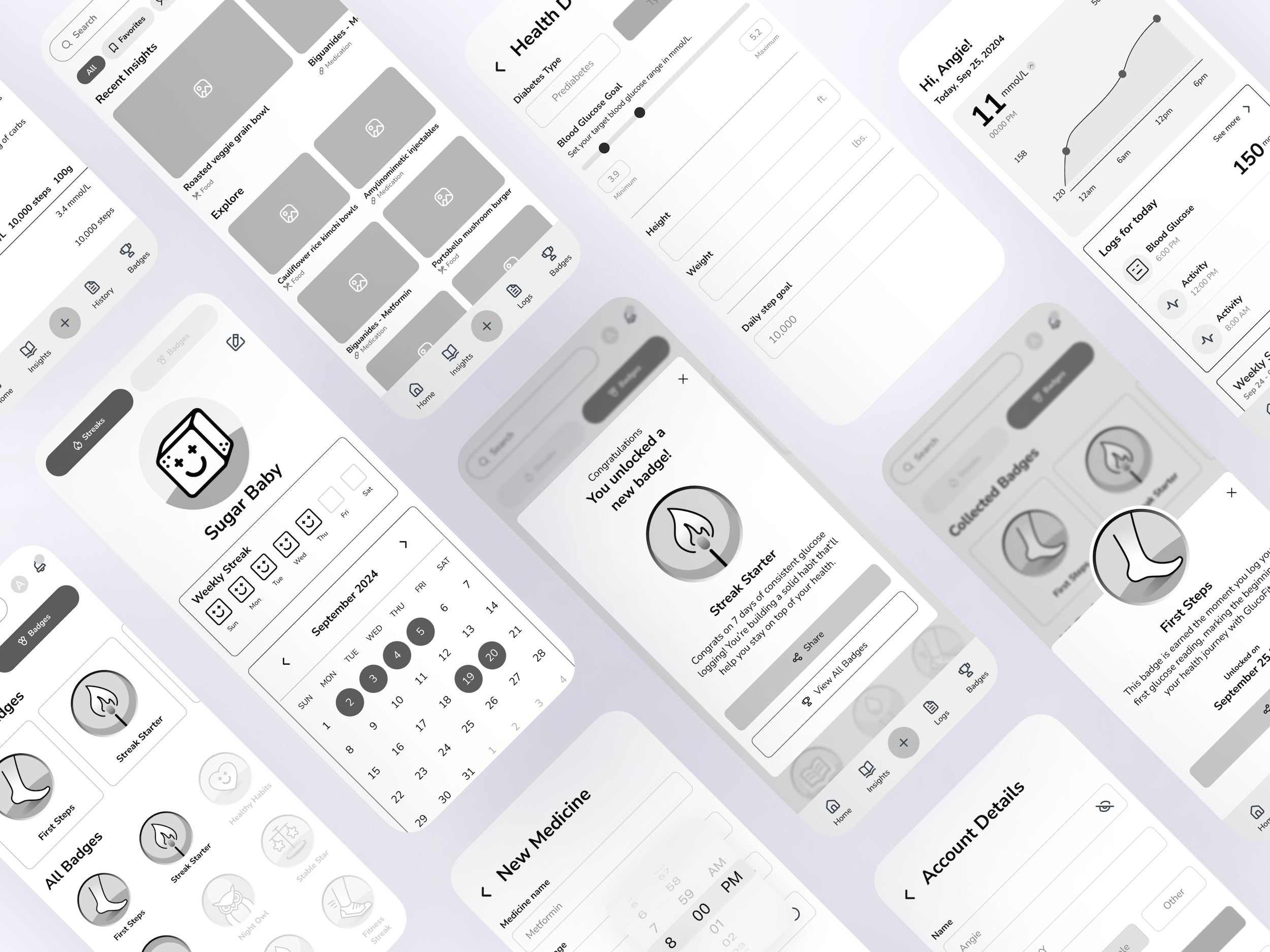
This was one a crucial step in ensuring the usability of the app. Through multiple iterations, we focused on the simplicity and accessibility to accommodate our target users who are primarily middle-aged and older adults.

High-Fidelity Wireframes
Homescreen
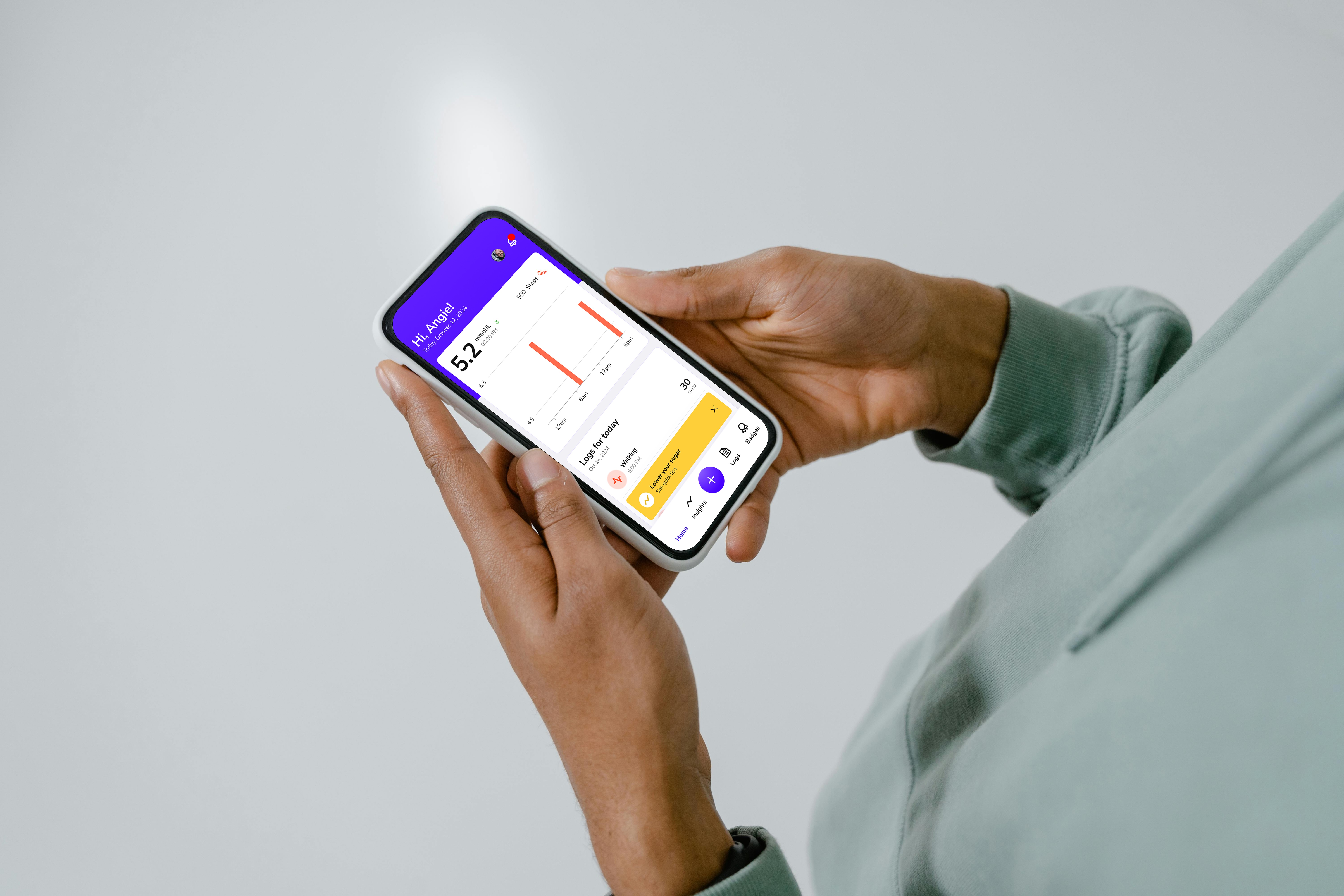
The homescreen was designed to be as simple and intuitive as possible. In the initial wireframes, we used line graph to display glucose trend. However, based on user testing feedback, we found that users found bar graphs easier to read and interpret. This made us revise the visualization to a bar graph, to improve clarity and usability for our target audience.

High-Fidelity Wireframes
Glucose Automatic Logging
The auto-logging feature is one of the projects core functionalities. It was also the most technically challenging to implement. This feature enables the app to automatically connect with a glucometer via bluetooth and seamlessly transfer glucose readings to the smartphone. This feature makes glucose monitoring more convenient and efficient for users.

High-Fidelity Wireframes
Personalized Insights
The personalized insights feature provides users with tailored articles and recommendations based on their daily glucose readings. Whether it's related to wellness, nutrition, or medication, the app generates content relevant to each user's condition to help them better understand their health and make informed lifestyle choices to improve their overall well-being

High-Fidelity Wireframes
Settings
The settings page allows users to manage their profile, update health information and edit or add medicine reminders as needed.

High-Fidelity Wireframes
Gamification
The gamification feature encourages users to log their glucose levels consistently by rewarding them with badges, streaks, and milestones, making health tracking more engaging and habit-forming.

UI Design
Logo
Our logo features a sugar cube that our team called "Sugar Baby". In this way, our app gives a fresh take on glucose management while balancing irony with approachability. We used plus and minus symbols for the eyes to indicate glucose highs and lows.
Colors
We chose indigo as our primary color for accuracy and trust while orange and yellow as our secondary colors for a friendly and motivating feel.
Typography
For typography, we used Nunito Sans for its soft, rounded edges and great legibility.
Illustrations
Our illustrations were based on the Sugar Baby to visually represent glucose readings.
Buttons, Icons and Badges
We design our buttons with rounded corners to maintain the friendliness of app. And our icons were designed as outlined to keep the simplicity. Lastly, our badge were carefully designed to enhance our user engangement.

Bug Tracking
Before launching Glucofit’s MVP, we conducted beta testing and bug tracking to ensure a smooth and functional user experience. My co-designer, Kath Nervez, and I thoroughly tested the app, identifying bugs and usability issues, and submitted detailed tickets to the development team. This process not only helped us catch and resolve technical glitches, but also allowed us to verify the accuracy of our design implementation, ensuring consistency between what was designed and what was developed.

Takeaways
When our developers struggled to integrate the glucometer with the smartphone, we thought it might not be feasible within our timeline. Although eventually they made it work, this caused delays and led some features being dropped. This experience taught me the importance of prioritizing core features, communicating challenges early and recognizing that asking for help is a neccessary part of building a successful product.
From a design standpoint, I learned that strong communication and collaboration are key to creating a consistent and cohesive user experience. At one point, a lack of clarity in task assignments led to duplicated work between desingers. This reinforced the value of regular check-ins, clear task assignments to keep the team aligned and avoid duplication.

